5 Essential Components of Responsive Web Design
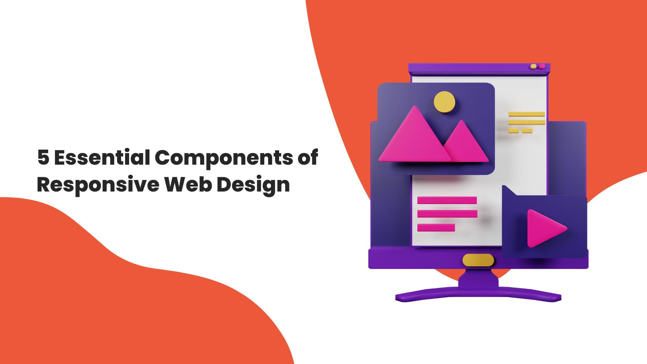
Responsive web design is one of the most crucial factors in the modern business world. It makes certain that your web site is optimized for different devices, which is good for users’ experience. Each of them is vital from flexible layouts to intuitive navigation and everything in between. In this new post of the blog, we will explore five key aspects of the responsive design Company, and we will provide examples and tips for your next project.
1. Consistency: Building Trust Across Devices
It is important to note that consistency is the key to any good website. Every visitor should enjoy the same layout and navigation and should have access to the same content whether they are using a desktop computer, a tablet or a mobile phone. A continuous design helps to build confidence and trust, improve user retention rates and engagement.
One perfect example of the consistency done on KlientBoost is consistency across the different platforms. The responsive design means that call to actions and other crucial components of the site look and perform the same on all devices. This integration increases their reliability and makes users to spend more time on the application.
Pro Tip: Use Twitter Bootstrap for creating websites that are mobile first and responsive to device screen size. It is not about looking the same; it is about having equal opportunity in accessing important data regardless of the client’s device.
2. Progressive Enhancement: Future-Proof Your Website
What progressive enhancement really means is the idea of creating a basic and functional design for a site, and then adding in extra functionality for any visitors with a more up to date device or browser. This makes certain that your site stays available as you adapt to the latest technologies.
Take GitHub, for instance. Having simplified the interface on mobile devices they cut out the interface clutter that is not required. The content-first approach adopted in this design makes most of the basic requirements like search and navigation easy to find.
Actionable Insight: It is necessary to start your design with fundamental content and fundamental functions. Add novelties step by step – animations, interactive elements or complex layouts to make the page more engaging but always keeping it compatible.
3. Navigation: Make It Intuitive and Adaptive
Navigation is one of the key components of user experience. People are to navigate through your site and do it comfortably regardless the device smartphone or widescreen monitor. Responsive navigation changes its appearance according to the device it is used on but does not lose its purpose.
Here, the most highlighted feature is WillowTree’s adaptive navigation design. In desktop view, the target audience is provided with additional navigation bar and more elaborate menus. In mobile version, the navigation is even simpler and clear, all the important links are presented in a convenient form.
Best Practice:
-
Plan your navigation with flexibility in mind.
-
Incorporate internal linking, clear call-to-action buttons, and sidebars for a seamless user journey.
-
Ensure your navigation menus adapt fluidly to different screen sizes and resolutions.
4. Image Optimization: A Must for Speed and Quality
Images are the key to the success of your site; however, optimized images will slow down your site and bore the users. Having good quality images that load quickly is crucial for keeping your visitors engaged and improving your search engine results.
Wired does an excellent job of making its images responsive. They use the ideas of the fluid grid and flexible image ratios so that all the visuals appear to be perfectly fitted for the devices. For example, on mobile screens, they crop images using a 16:9 ratio for quality without compromising for speed as it is vital to the function.
Quick Tips for Image Optimization:
-
Resize images: Maintain a balance between size and resolution for faster loading.
-
Compress files: Use tools like TinyPNG to reduce file size without compromising quality.
-
Choose the right format: JPEG is ideal for faster loading, while PNG works well for detailed visuals.
-
Utilize caching: Implement CDN or server-side caching to speed up image delivery.
5. Whitespace and Padding
One element that is usually neglected in web design is whitespaces and yet it is very important in making the read plus help in directing focus. Correct spacing helps the material be more aesthetically pleasing and better organized, particularly when viewed on a mobile device.
Dropbox is one of the best examples of how whitespace should be used in a responsive design. They make use of padding and margins in a way that they change depending on the device to ensure a clean looking interface. In desktop view, they use simple scrolling arrows, and in the mobile views, they keep their navigation straightforward and minimal.
Pro Insight:
-
Test your site’s readability on various devices.
-
Adjust padding and margins to ensure content isn’t cramped or cut off.
-
Use whitespace strategically to highlight key elements and guide user focus.
Why Partner with a Responsive Design Company?
Responsive website design is a complex process that is based on the knowledge of the audience, cross-platform issues, and trends. A professional company for responsive website design will assist you in designing and developing a website that is both good to the eye and optimally functional on any device. Responsive design is, therefore, not a fad but a crucial tool in today’s world where so much is done online. Thus, paying attention to the consistency, the progressive enhancement, navigation, images, and whitespaces, one can be confident that the website will look unique in the middle of the numerous competitors.
Final Thoughts
Responsive web design is the solution to providing better UX across multiple devices. Adding these five elements can help you build a site design that is not only aesthetically pleasing but also very effective.
Remember, the goal is to make your website accessible, efficient, and engaging for every user, regardless of the device they use. Ready to take your website to the next level? Reach out to a responsive design company and turn your vision into reality!


